DISCLAIMER: There is no possible way for this article to be biased, because I’ve been in Modesto City Schools for just over a week, and, frankly, had no idea half of these schools (or their mascots) existed. That being said, all that is being critiqued is the quality, creativity, and originality of these mascots, worst to best. Enjoy!
GRACE M. DAVIS HIGH SCHOOL
Last, and rightfully least, Grace M. Davis’ Spartan. Why does literally every school and every university have Spartans as their mascot? Pushing the absolute lack of uniqueness aside, if images could put people to sleep, I would be snoring with Zs floating out of my mouth cartoon-style. It’s as if someone took a clipart image of a helmet and slapped it on a background. There’s no personality, no character, I’m not terrified of it so therefore it’s not intimidating enough. This had potential, but Davis High yelled, “SPARTA!” and threw it over a cliff.
JOSEPH A. GREGORI HIGH SCHOOL
A jaguar is a sick mascot, I’ll have to admit, but the execution with this logo makes me sick. I only just realized those lines coming out of its mouth were whiskers. Why are they inside its mouth? Did their graphic designer get distracted and let his pencil slide to the left? I’m going to let the absurdly blue tongue that looks like it ate an Airhead slide, because I suppose those are their school colors. I did enjoy imagining that the jaguar had eyeliner on, though…
PETER JOHANSEN HIGH SCHOOL
Johansen, Johansen, Johansen. Listen, I know Vikings are vicious, have wicked beards, and almost always have voices 3 octaves lower than ours, so why not make them the star of your logo? The ship is alright, I suppose, but the fact that it’s enclosed in a circle reminds me of the personalized pins they had me make in 6th grade with the banner around them. I also didn’t appreciate the lettering within the circle. A mascot should be so widely recognized that a school doesn’t need their school’s name on it. To conclude, let your ships sail free, Johansen.
THOMAS DOWNEY HIGH SCHOOL
I couldn’t really find what Downey High’s official mascot logo was, so I settled on this one, because it seemed to encompass the masked knight and the lame lettering. But Downey’s pretty smart for using a knight. They get away with just using a helmet, but the detail is the only thing keeping me from unsheathing my sword and coming at this dude. Where are his legs? Also, there’s so much shadow in this photo, the hand looks like it was drawn by a 7 year old, floating in the dark. There’s not really much for me to complain about here, but they could’ve done better. 5/10.
JAMES C. ENOCHS HIGH SCHOOL
Now we’re talking. This eagle looks ferocious. He is not taking anything. That furrowed brow makes it seem like I’ve pissed him off beyond compare and now he’s swooping in to gouge my eyes out. So cool. Someone told me it looks like he has two sets of wings, which I think makes this logo a bajillion times better. It makes me uncomfortable how his feet are portrayed as being bigger than his head, and there is a banner again, but this color scheme has me swooning. I know it’s supposed to be black and gold, but it looks like beige and I’d like to think of it that way, thank you very much.
FRED C. BEYER HIGH SCHOOL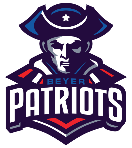
I just can’t bring myself to meet the eyes of this guy. Does he even have eyes? Or have his sockets hollowed out during his days of unrighteous conquering of native land? Wow, this logo’s cool. I heard that Patriots are a very common mascot, and I can imagine that red, white and blue as your school colors would be very funny. It’s like every day’s the 4th of July! Having an old American soldier as your mascot is a tad controversial, but I understand that they’d want the racist, power-hungry, oppressing excuses for human beings right next to the Vikings and Panthers. However, the detail on his face, the expression and the super dramatic lighting puts this towards the top of my list. Good job, Beyer!
MODESTO HIGH SCHOOL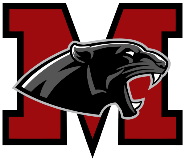
This has gotta be, hands down, not only one of the most awesome mascots I’ve seen, but one of the coolest logos, too. Just take a second to appreciate it. Really look at it. This Black Panther vibe is eve-ry-thing. For my artsy folks, look at this rim lighting on his head! And while the ‘M’ in the back may seem to clash with the detail of the panther, I think it serves as an emblem for what this guy’s roaring about. I may not be making any sense, but MoHigh knows what they’re doing. 10/10.

